Rivers Edge Winery came to North Sixty Four in need of a brand identity for their new local winery in Elba, Nebraska, that reflected their connection to the land with a playful, soft color palette.
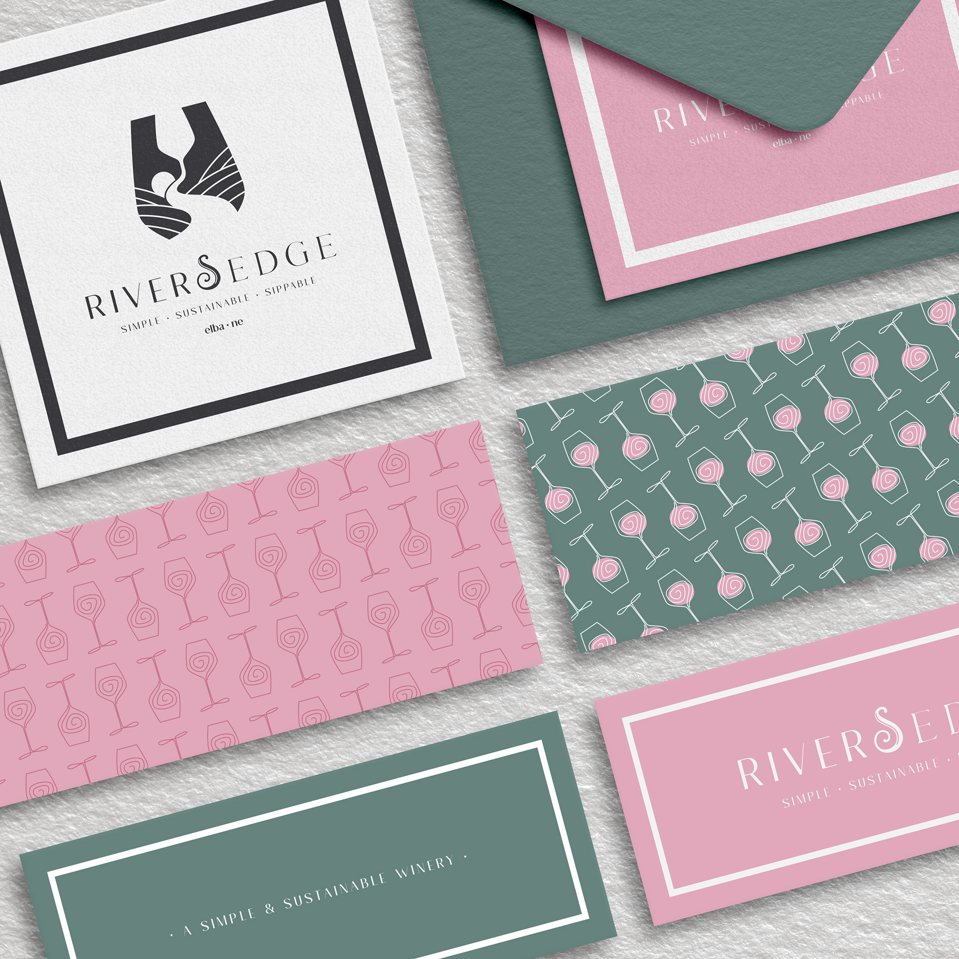
Set within the silhouette of a wine glass, the logo unites landscape and craft with rolling fields and river that defines the property. A second glass nested inside subtly represents the two sisters behind the winery, reinforcing partnership, family, and shared ownership.
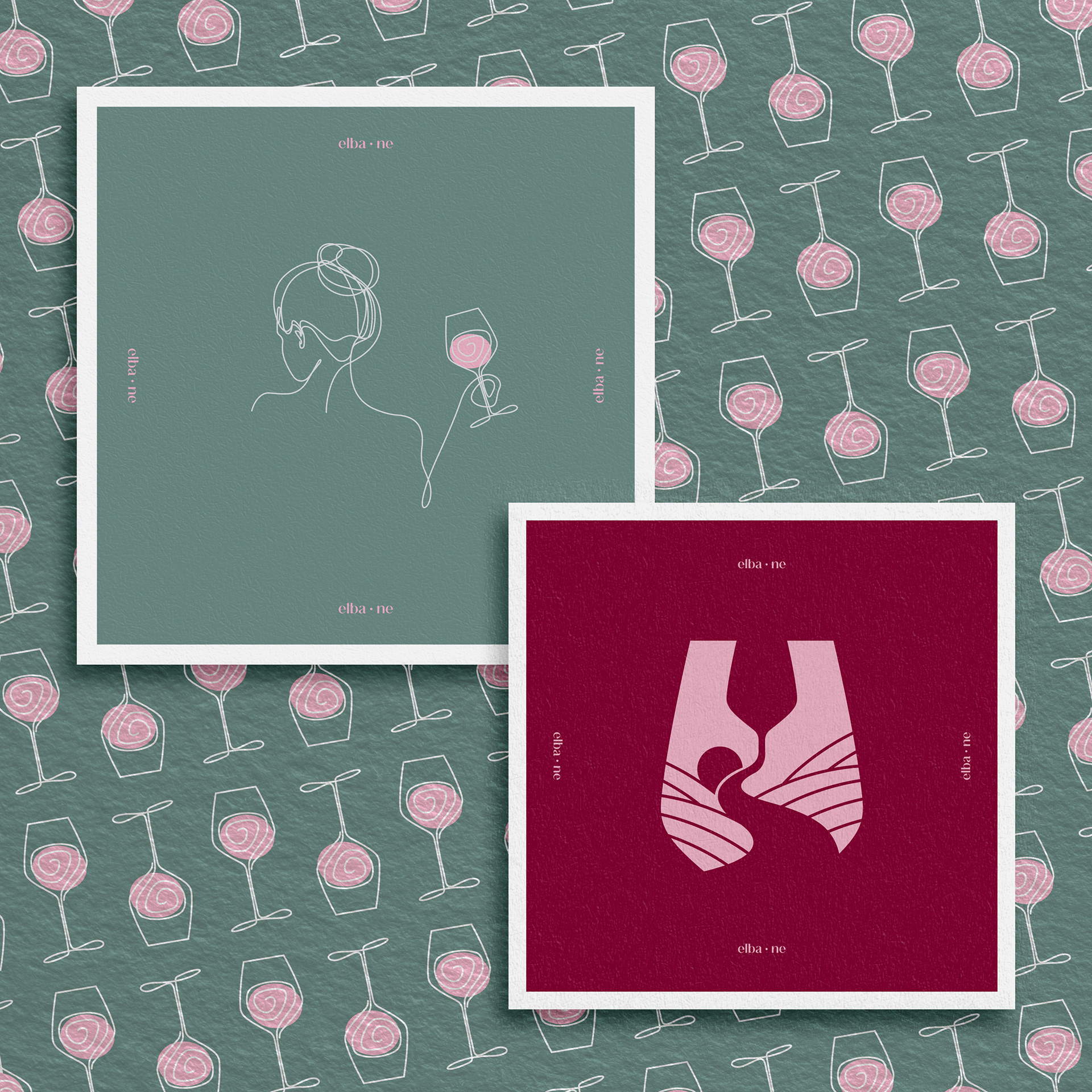
Coasters for the winery's tasting bar helped to add another touch point to the brand throughout the experience..
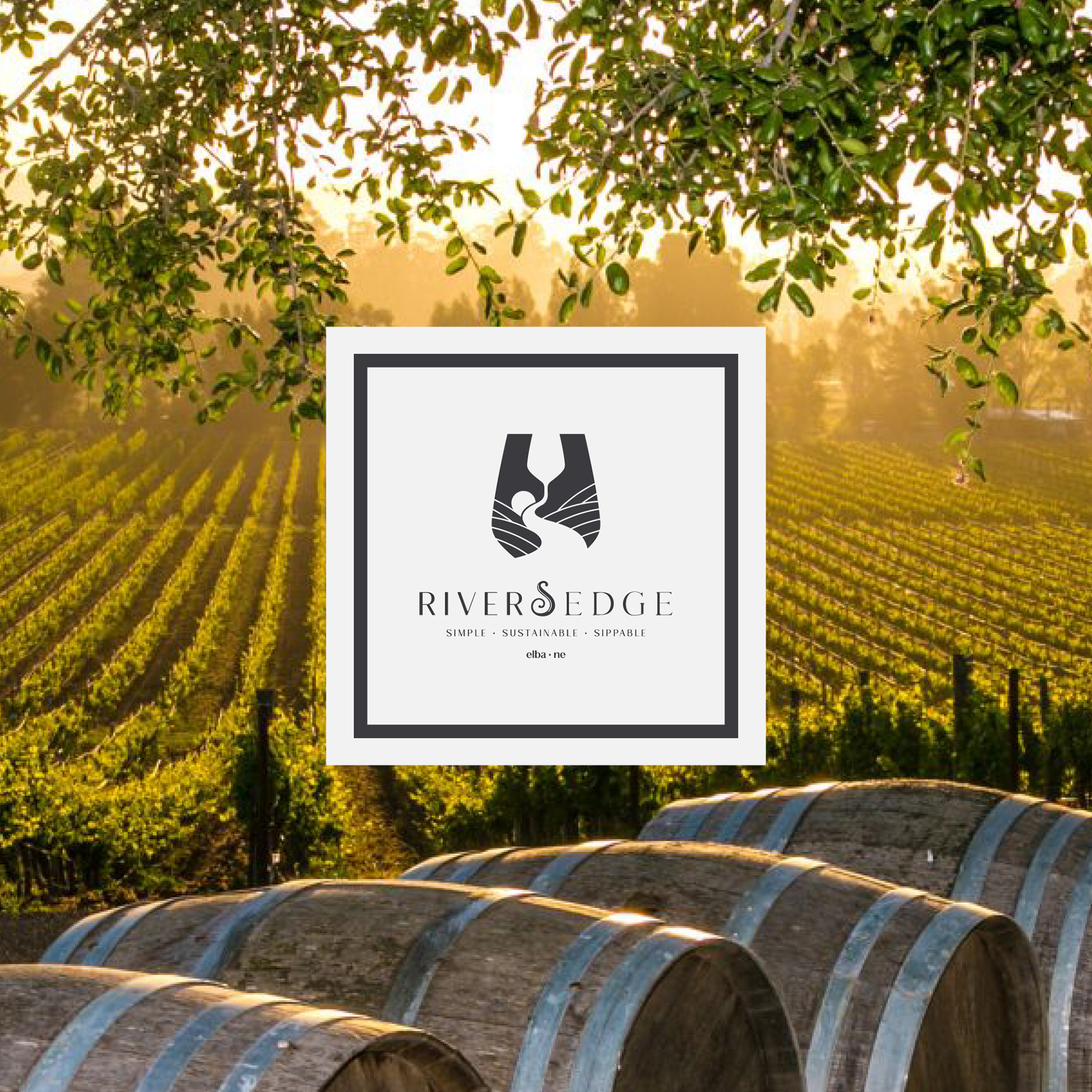
The Rivers Edge Winery logo.
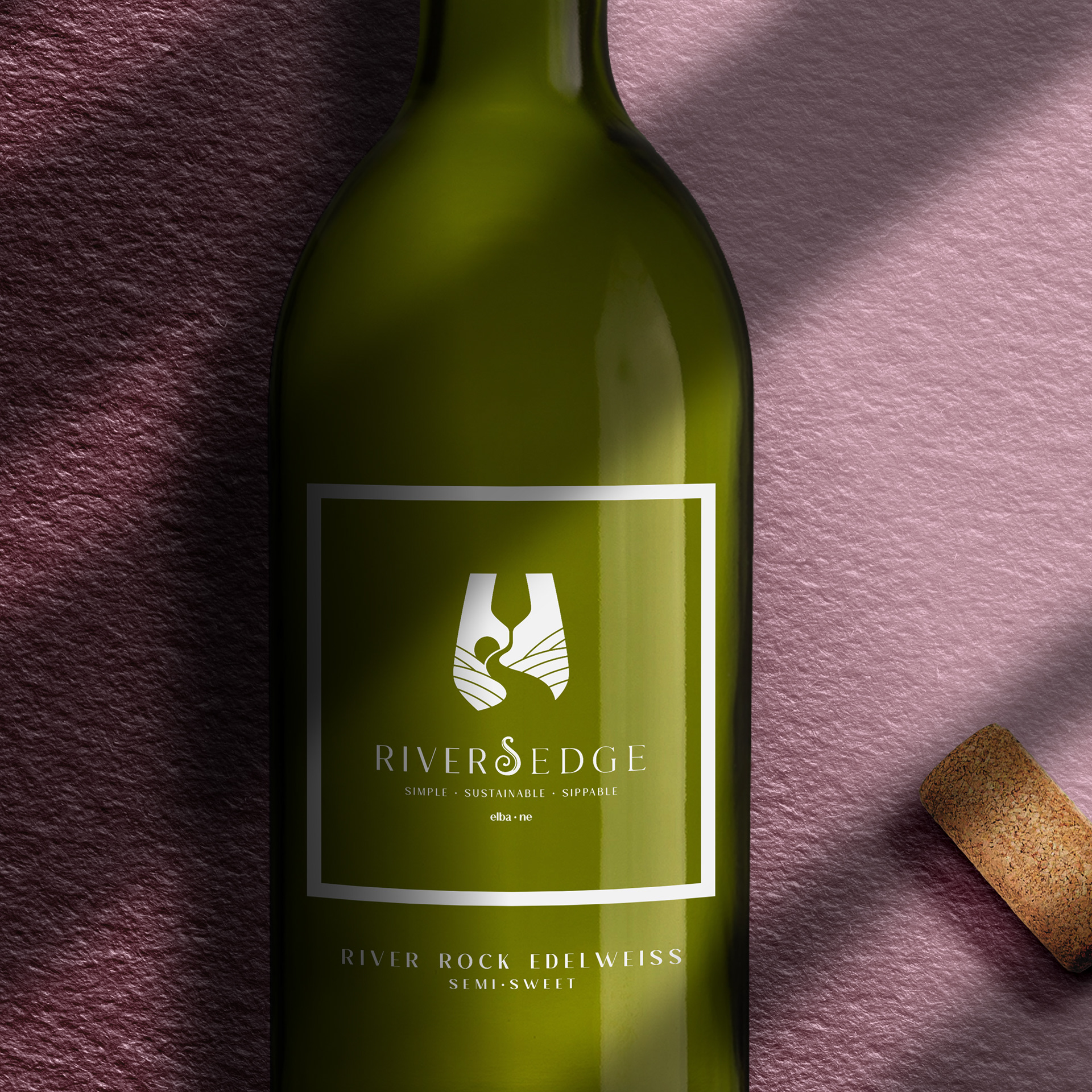
Rivers Edge winery River Rock Edelweiss offering.
A palette of wine reds, blush tones, earthy greens, and soft charcoals balances richness with approachability. Minimal line illustrations of a woman holding a glass add a human, feminine touch—echoing the sisters’ presence and the act of gathering.
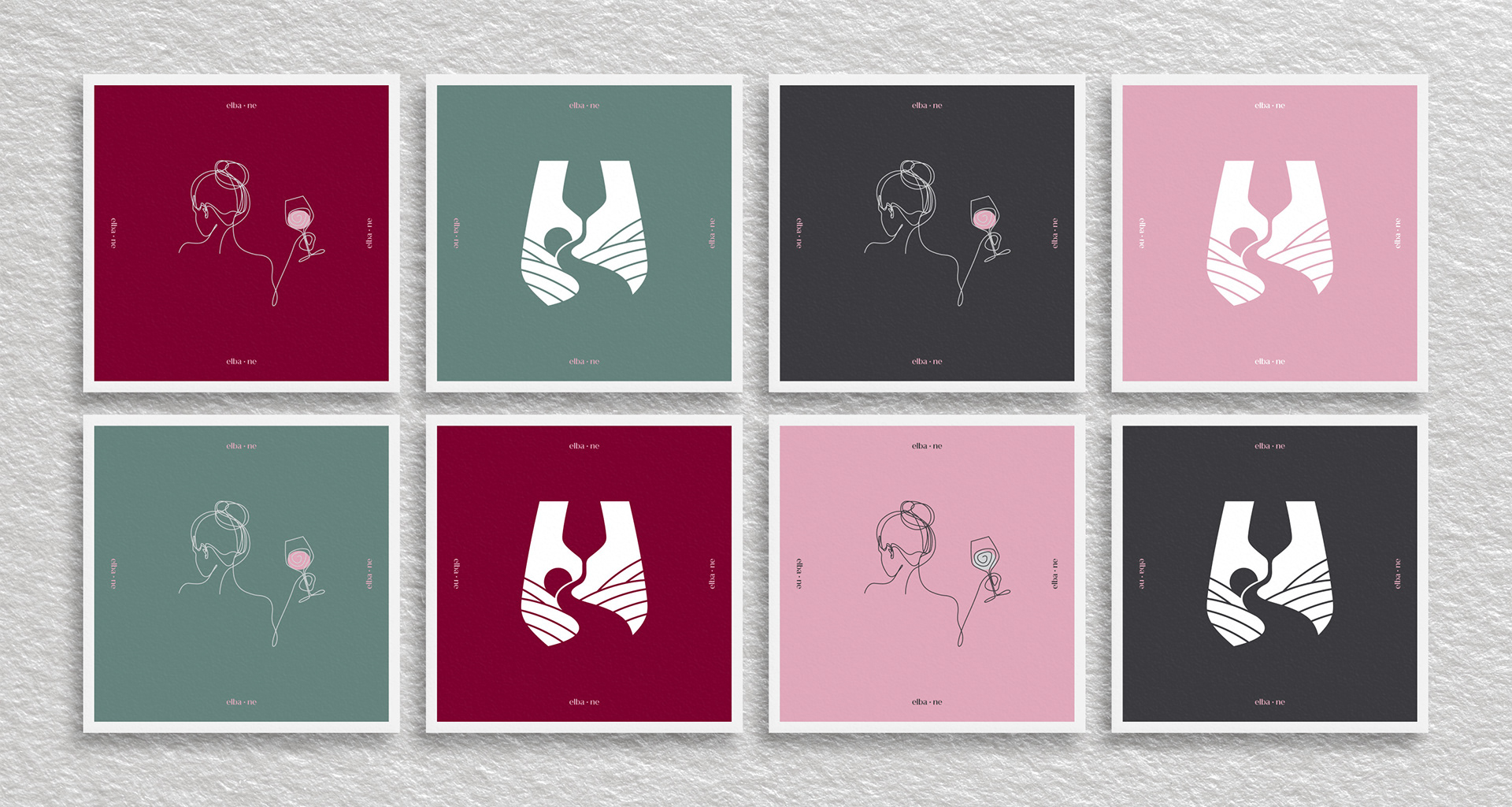
From bottle labels to coasters and supporting materials, each touchpoint was designed to feel refined yet welcoming, creating a consistent, story-driven experience that unfolds in both visual and tactile moments.
Ready to Forge Your Story?
Let's make your business look intentional, sound persuasive, and sell confidently.
Book a call with us today!