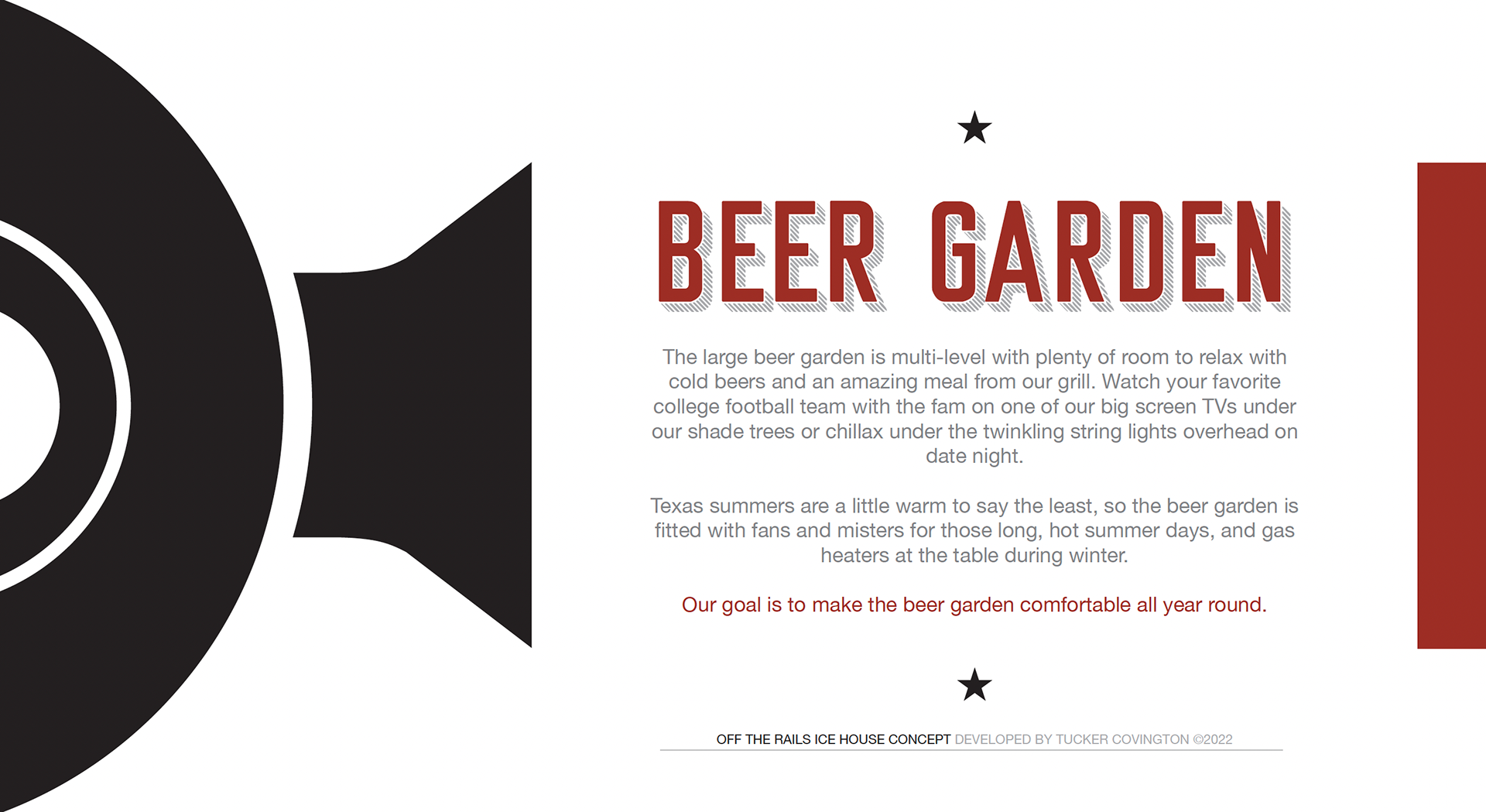
Off the Rails is a Texas-themed, tree-covered beer garden and restaurant that capitalizes on Texas patio weather and meant to be enjoyed by all age groups. The team came to North Sixty Four design for a logo mark with a preferred color palette in mind.
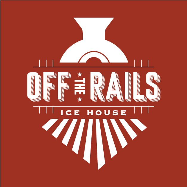
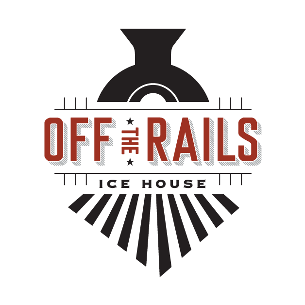
A stylized locomotive anchors the mark, instantly signaling movement, strength, and arrival. The rail lines and structural elements frame the logo, reinforcing connection and destination, and balance vintage-inspired details to evoke classic Americana.
The identity draws from the grit and history of rail culture, using strong geometry and industrial forms to ground the brand in authenticity and a sense of place. From signage to apparel and digital use, the logo was built as a flexible system to maintain impact, legibility, and character at any size or application.
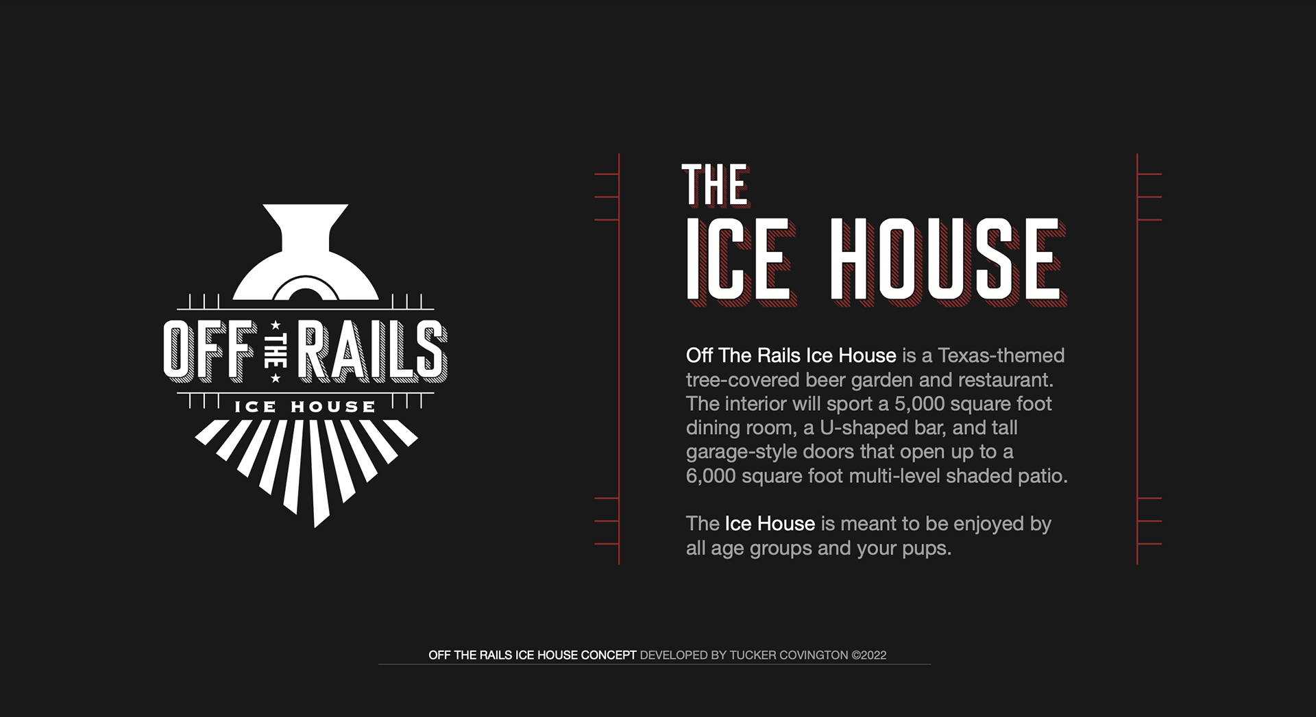
Off the Rails Ice House is the brain child of two industry professionals that is currently amidst its construction phase. The contracted project is still in the works, waiting for the framing to complete before we kick off the rest of the visual branding to be included in menus, in-store signage, and beer garden aesthetic.
Ready to Forge Your Story?
Let's make your business look intentional, sound persuasive, and sell confidently.
Book a call with us today!